Have you ever felt confused and frustrated while using a new product, so much that you swear never to lay your hands on it again?
The impact a product creates in one’s life decides how long they keep using it. If the UX of the app does not satisfy the user, they most likely will look for an alternative. It is thus your responsibility to make them want to stay by giving them a better onboarding experience.
User onboarding marks the starting point of the user’s journey from landing on the product and familiarizing them with its features.
To help you understand the user onboarding, we look into the best apps in the market which gives customers the best onboarding experience.
Why is User Onboarding Important?
The users abandon your product when they find it overwhelming, confusing, and difficult to understand. No user will be patient enough to wait and study why your product is relevant in their lives. Thus they simply stop using it and choose easier and similar alternatives. This eventually reduces the user retention of your product and winning back these potential customers becomes difficult over time.
Thus a good onboarding flow that helps the user understand the product and its relevance will result in low churn, higher retention, and higher customer satisfaction.

Show your users some love! Design their onboarding experience better.
Talk to Us
#1 Slack
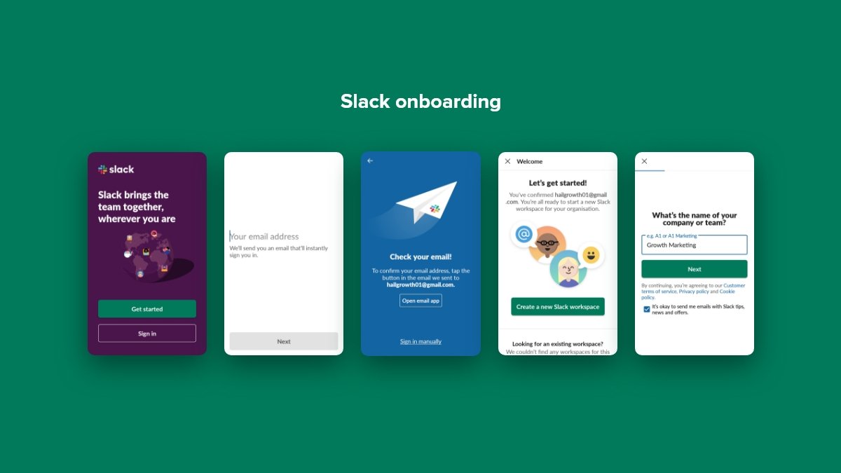
Slack is the ever-popular team-messaging app that does full justice to its job of explaining itself to the new users that continuously come to the platform. The same is made possible with its well-designed empty states and very clever use of its own core functionality. As of October 2019, Slack had around 12 million daily active users. It has a particularly engaging new-user onboarding experience that sets it apart.
- New users feel encouraged while using Slack to learn the product by actually using it, having a message prompt from the friendly Slackbot.
- It offers brief and informative tooltips, allowing the users to end the tour as and when they want.
- Slack implements a modal window to enable desktop notifications that ensure that the users will complete the customer onboarding flow.
#2 Duolingo
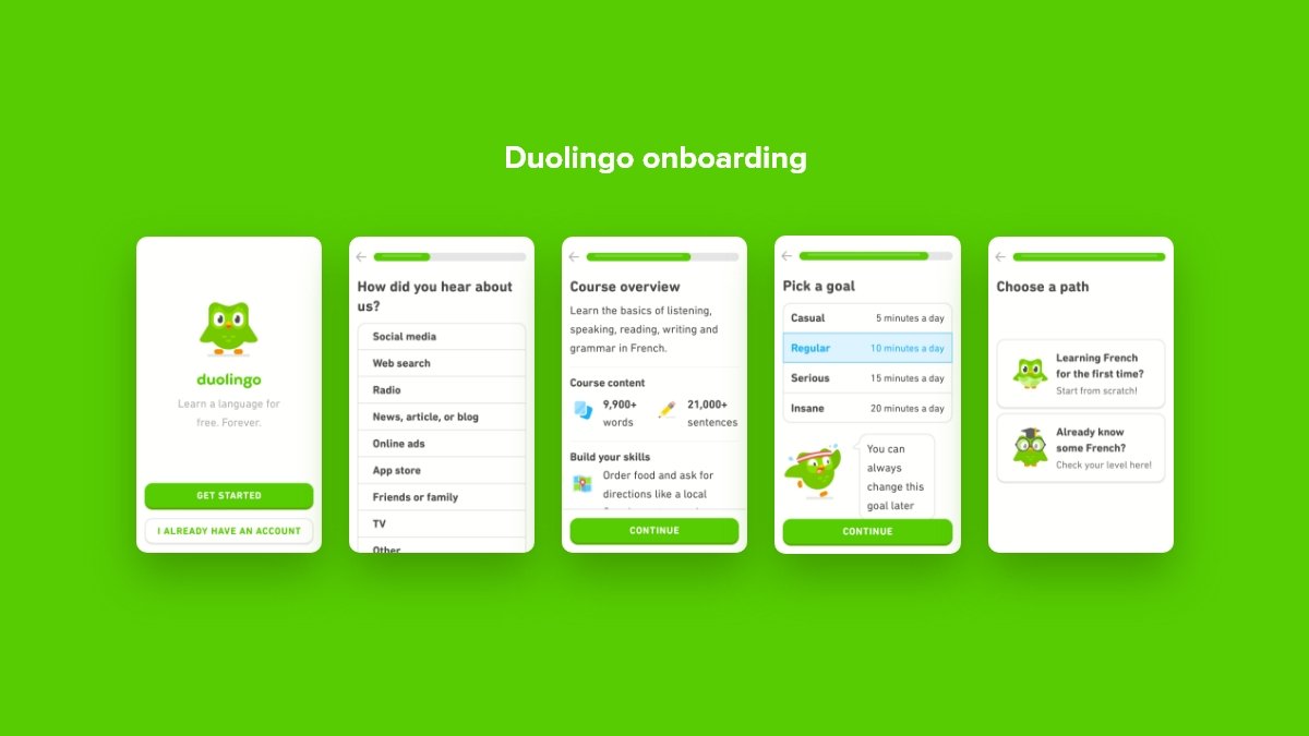
Duolingo’s mobile app onboarding is a bit different from the majority of apps out there. It starts with the product and ends with a signup form which is an excellent example of gradual engagement. Duolingo has built a $700 million business with its addictive language-learning app with over 500 million users as of 2020.
- Gradual engagement includes postponing registration until the moment when users have no choice but to register in order to move forward.
- It does the same very swiftly by guiding the visitors using their onboarding flow through a quick translation exercise.
- This exercise makes the users understand how quick and easy it is to learn a new language.
- Later, it asks for sign-up.
It restricts certain features that remain off-limits to unregistered users, but they can access the app’s core value proposition of daily language learning without having to create an account.
#3 Figma
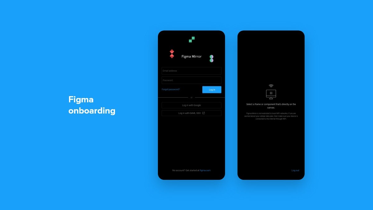
It’s a flexible cloud-based tool (with a total funding amount of $132.9M) that can be used to manage collaborative UI design across different platforms. It allows teams to work on designs and provides them with real-time feedback while allowing them to share files within the tool.
- Figma offers step-by-step guidance on how to use the tool allowing the users to take advantage of the platform’s benefits ASAP.
- It encourages users to go through the SaaS onboarding sequence by letting them know the key differences between other tools and Figma.
- Figma has a user onboarding flow that caters to all types of learners. All tooltips in the flow are clear and concise, explaining the features.
- It also has animations illustrating the features’ functionality.
# 4 Mailchimp
Mailchimp recently redesigned its identity that has all the qualities the company is known for. It provides them with room to expand their offerings and connect with even more small businesses. Mailchimp now has a total audience of 4 billion and around 11 million active customers.
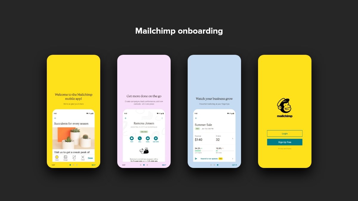
- New users don’t have to deal with the product or its features.
- Its onboarding questionnaire has simple questions about users’ businesses and guides them to the right solution based on their answers.
- It understands their specific needs without exposing users to the product before they’re ready.
- What makes it even more fun is Mailchimp’s clear UX copy and illustration sequences that help inspire confidence in users that don’t have any experience with marketing software.
# 5 Trello
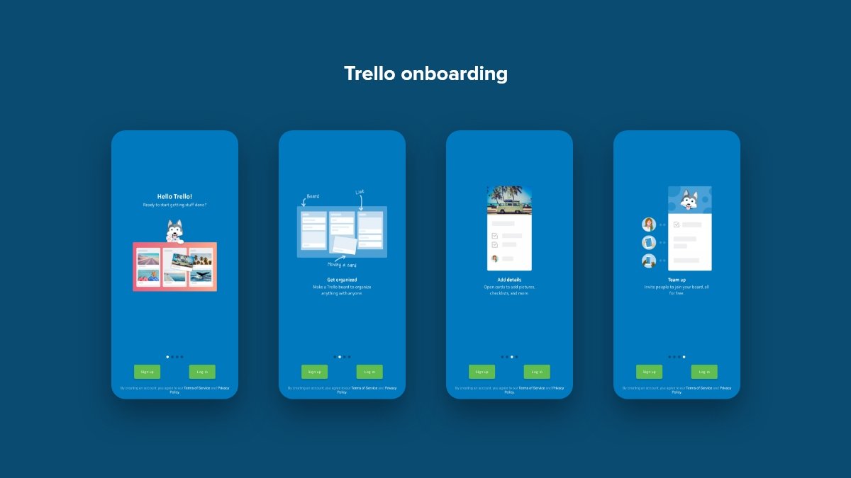
Trello (with 50 million users as of February 2021) is a widely adopted project management and team collaboration tool. It is best known for its friendly Kanban board. Its new user onboarding has been getting a lot of attention — Trello’s Welcome Board for new users fills out the fields in order to demonstrate what all the users can do on their board.
- It all starts with an action statement having a card at the top of the first column in the form of instructions for the users to move that card into the next column.
- It involves the new users immediately in playing with this new Kanban board.
- Another card located down involves action on the part of the user to open up a card and see all of the different things that can be added to them.
- Trello demonstrates everything within these first two cards related to all the needs of new users to get started organizing their own projects.
Warning! Viewing our portfolio might urge you to update your product.
Yes! Take me there!
# 6 Webflow
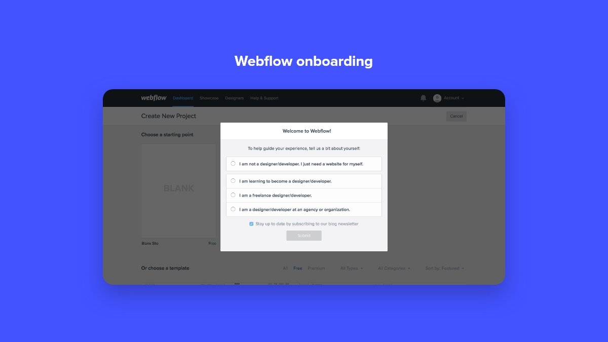
Webflow perfectly understands that it takes a lot of work to go into launching and maintaining a website. This is why the company strives to make this process easier and painless. Instead of leaving users hanging in HTML5, CSS, or JavaScript, it provides them with a clean, visual interface that can be used to create a customized website.
- Each tooltip offered by Webflow includes a gorgeous auto-playing video allowing new users to familiarize themselves with the functionality of each feature.
- Such an onboarding experience helps users get started quickly as they can see the product in action.
- Tooltips have internal links that allow the users to dive into certain features more extensively. It even offers the users courses at Webflow University.
- Its drag-and-drop elements help users create the website they envision with no limitations that might occur due to lack of coding experience.
- It incorporates all the necessary tools, such as responsive design elements, classes, typography, colour, and flexible layouts.
Webflow Ecommerce is growing continuously with over $23 million goods sold in 27 countries.
# 7 WhatsApp
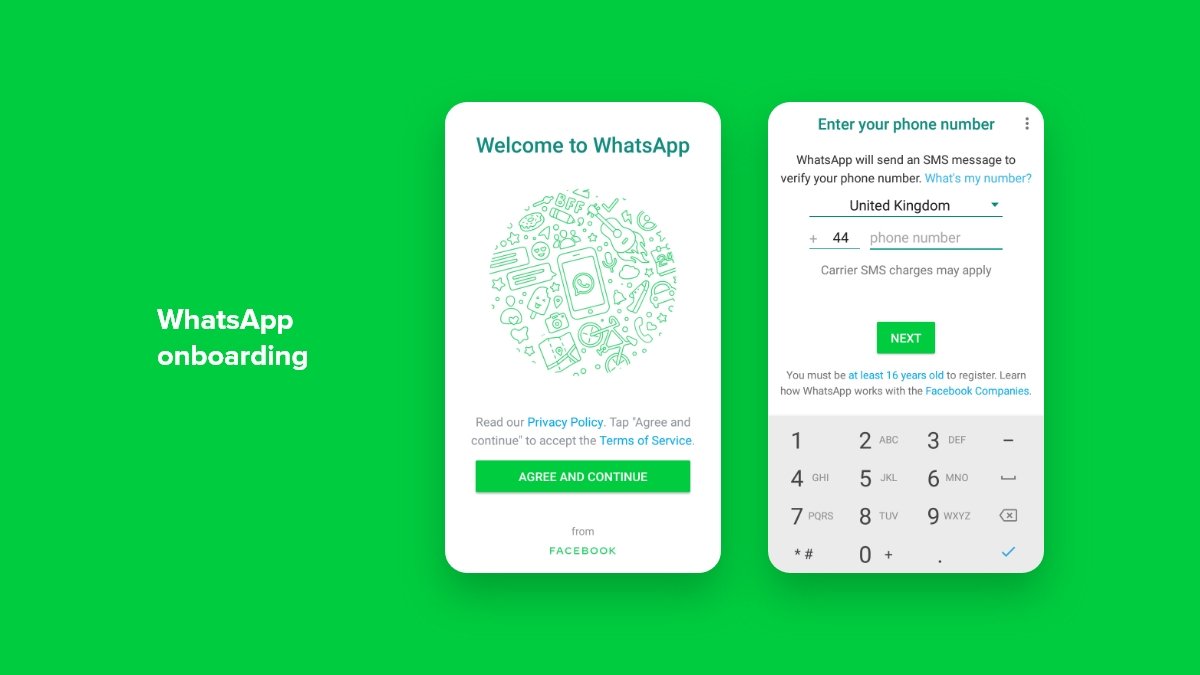
WhatsApp has been defying all sorts of expectations by doing many things contrary to what common sense in a mobile design dictates. It has managed to build a huge user base which led to a record acquisition by Facebook. Though its user onboarding flow is very conventional since it is all about taking the appropriate steps to guide users to the value it brings.
- It offers a well-designed legal opt-in and doesn’t overwhelm users with legalese and technical language on the first screen.
- WhatsApp has a strong value-driven explanation for why it needs access to users’ contacts, photos, and SMS.
- The app uses SMS as a way to simplify phone verification with automatic OTP detection. It is a smart way to keep users sticked to the app while onboarding.
WhatsApp has a combined user base exceeding half a billion, with 573.6 million monthly active users based in the top 3 WhatsApp countries: India, Brazil, and the US.
# 8 LinkedIn
LinkedIn (with a brand value of $4.84 billion and annual revenue of $8.05 billion) is a professional social network with 740+ million users from over 200 countries. It has a consistent mobile app onboarding flow for users across different devices. This means that you will have the same experience irrespective of which mobile device you choose to use.
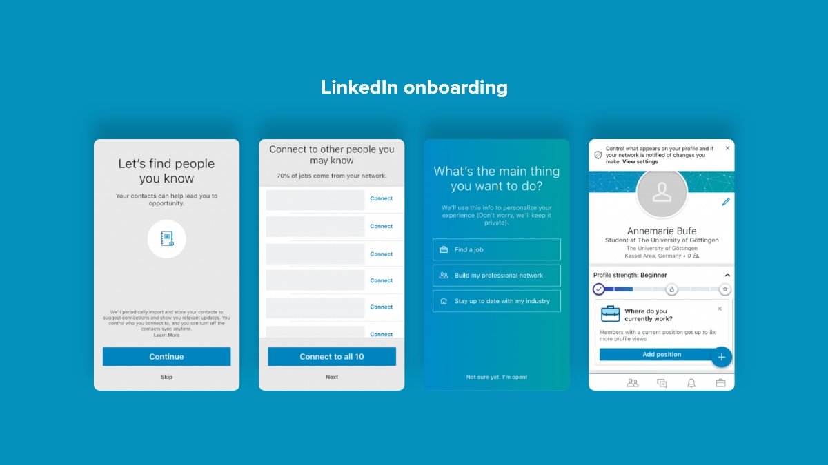
As soon as you open the LinkedIn app after downloading it, you will see a friendly message: “Make the most of your professional life.” It provides a lot of information about the app’s purpose and functionality.
- You can learn about the benefits of using LinkedIn by swiping through the screens.
- LinkedIn offers a progressive mobile app onboarding flow, guiding you to set up your profile.
- Fill in your personal information, receive an email confirmation, follow LinkedIn groups and thought leaders you like, get suggestions for your professional network, and you are done. As simple as that.
# 9 Strava
Strava is a social networking site for athletes and cyclists that helps the users keep track of their runs and rides through GPS. It has over 76 million users and the number is only increasing since it offers a great onboarding experience.
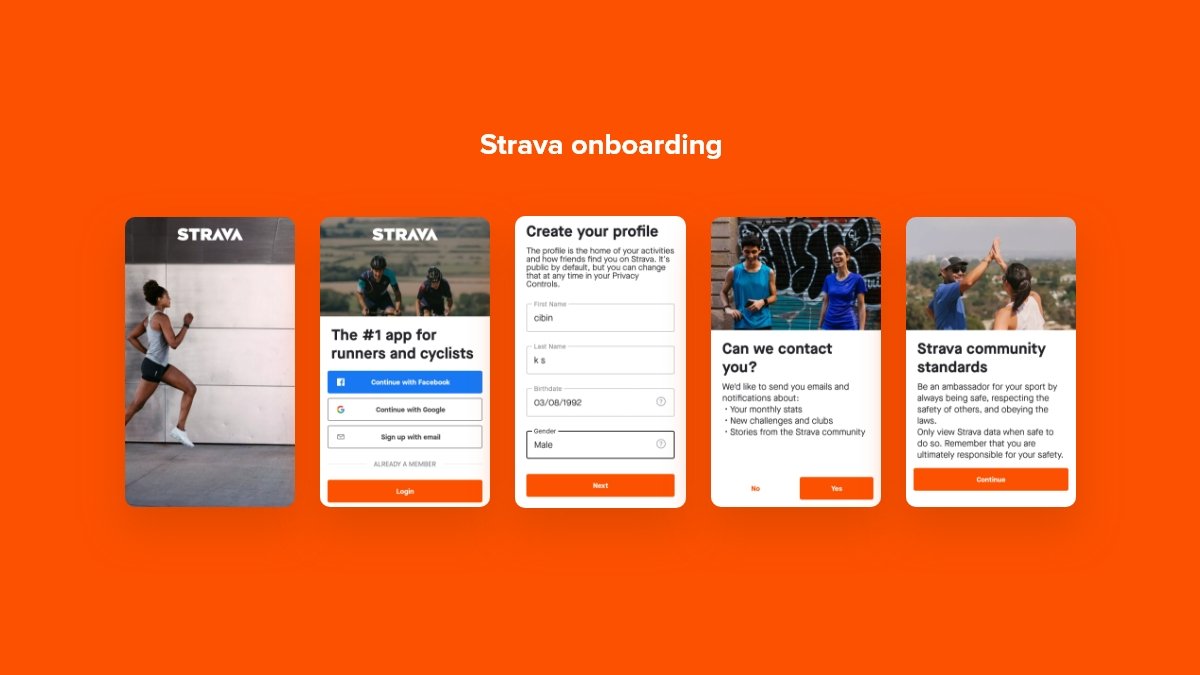
- Users can sign up quickly via Facebook, Google, or email.
- While signing up, you are directed to a page where you can import your Facebook contacts or search for users by name.
- After following people, it directly asks you to begin to use the app.
- You can start an activity like running or riding, and can check out the rest of the functionalities.
Easy and relevant tasks with a tidy and simplistic UI: Strava’s onboarding strategy.
# 10 Instagram
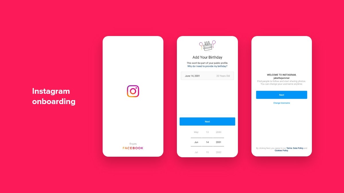
Instagram, with more than 1 billion monthly active users, is the most used photo-sharing app that provides users with an easy-to-navigate onboarding experience. It facilitates the users to sign up either with their email ID or Facebook account.
- Facebook then takes over and uses its power to work for you and provide you with pre-filled form fields.
- It provides you with a friendly environment by suggesting friends that already use Instagram.
- This way, it creates FOMO: fear of missing out which serves as a motivation trigger and makes the user complete the onboarding flow.
- You can follow celebrities and other public figures which is another relatable thing for the users.
# 11 Grammarly
Grammarly is yet another popular tool helping users by acting as their personal writing assistant. It allows the users to check for spelling, grammar, and word choice along with in-line suggestions. It has 6.9 million daily active users.
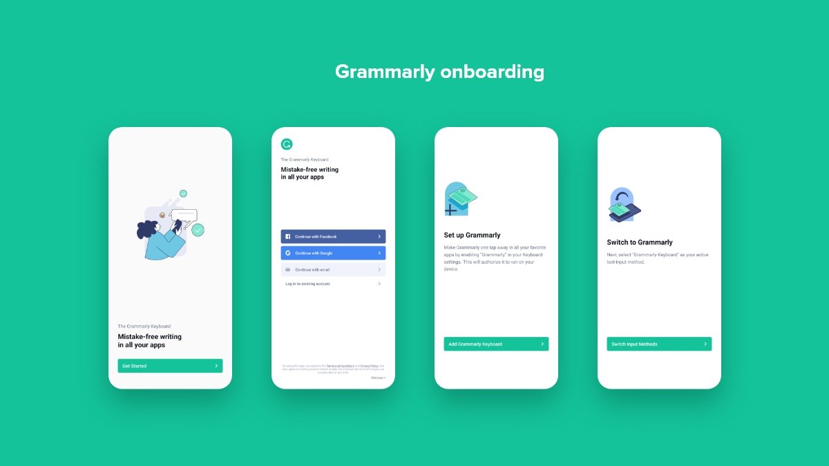
Grammarly’s UX does a great job with everything from emails to upgrade prompts, and its onboarding experience is no exception either. It follows a learn-by-doing demo doc which encourages discovery while teaching the users how to use the tool’s myriad features under a controlled environment.
- It offers the users a demo document: a brilliant example of “learn by doing.”
- The application introduces the users to the UI patterns they’ll need—one step at a time and true to form.
- Its colour choice to indicate errors or suggestions act as a cherry on the top.
End note
These apps we looked into sets an example for onboarding flow that helps in providing the users with the comfort of understanding and trusting your product making the journey forward easier.


