Designers around the world face the constant pressure and fear of their users abandoning their mobile apps. The fear is real since users are quick to download apps and even quicker to delete them from their systems as soon as they lose interest in them.
Don’t worry!
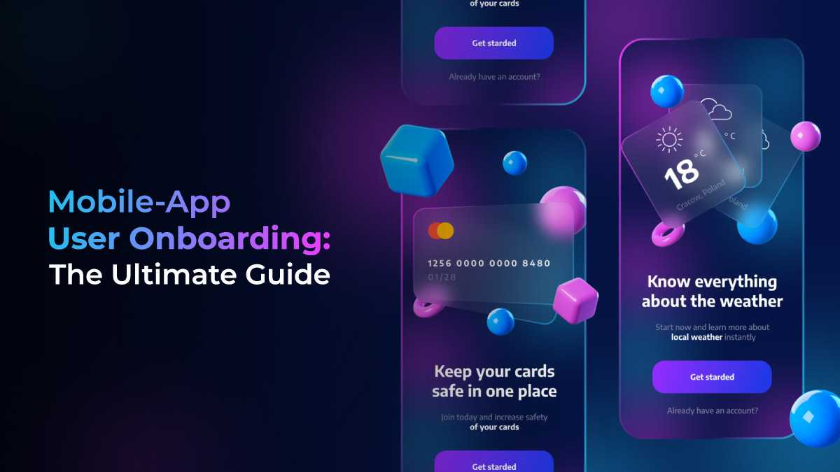
We have prepared this complete mobile-app user onboarding guide to help you deal with it and help you get past those crucial first moments of contact. But first, we need to understand the importance of mobile app onboarding and why it is needed.

Get personalized solutions for your UX design challenges.
Talk to us!
Check out all major topics directly from here 👇
When does a Mobile App Need Onboarding?
Users always need some amount of time (no matter how minimal it is) so that they can learn about a new app and understand its functionality. But don’t let that put you in any delusion that all apps require separate onboarding flows or lengthy explanations. In the majority of cases, mobile app onboarding is not required as users are able to learn the interface by using the app, and thus instructional onboarding flows are not necessary.
Even for fairly complex mobile apps for that matter, it’s way more effective to let the users explore the app on their own instead of assisting them with product onboarding sessions.
But if you still want that, you can train users by showing them tips in context instead of presenting them with a user onboarding tutorial that explains the app’s UI. The reason for the same is that people are simply unlikely to remember a lot of information, especially if they are not even sure about using the app in the long run.
Not to mention that errors are a negative element of user experience but messages showing error occurrence can teach users a bit more about the app in a “teachable moment.” It would make the whole process fun where people will have some degree of motivation to read a few words that will help them fix the problem.
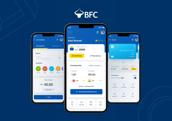
How our UI/UX team made BFC Payment app the trusted choice…
The BFC Pay app is an intuitive and trustworthy payment app based out of Bahrain. The app is one of the select…
View Case Study
Here are some instances when user onboarding screens can be useful in a mobile app:
-
When User Information is Required
When you need user information to get started and there is no other way around. For instance, if we have a banking app in front of us, it will ask the users to create an account and confirm their identity before it can actually be used by them.
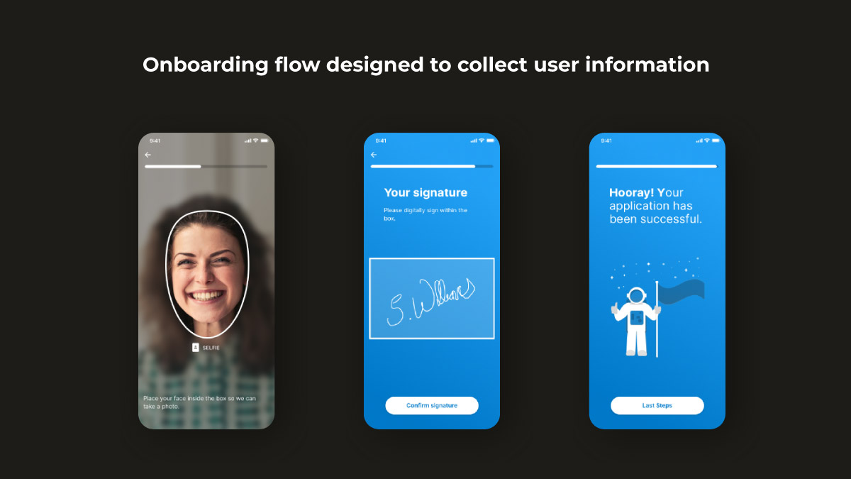
A banking apps onboarding UX designed to collect necessary information of a ser to start using it -
Highly-Tailored Functionality
If you have built an application that has highly-tailored functionality to the user’s context and preferences, user onboarding is required. For example, a dieting or workout app can only benefit the users after knowing their current weight.
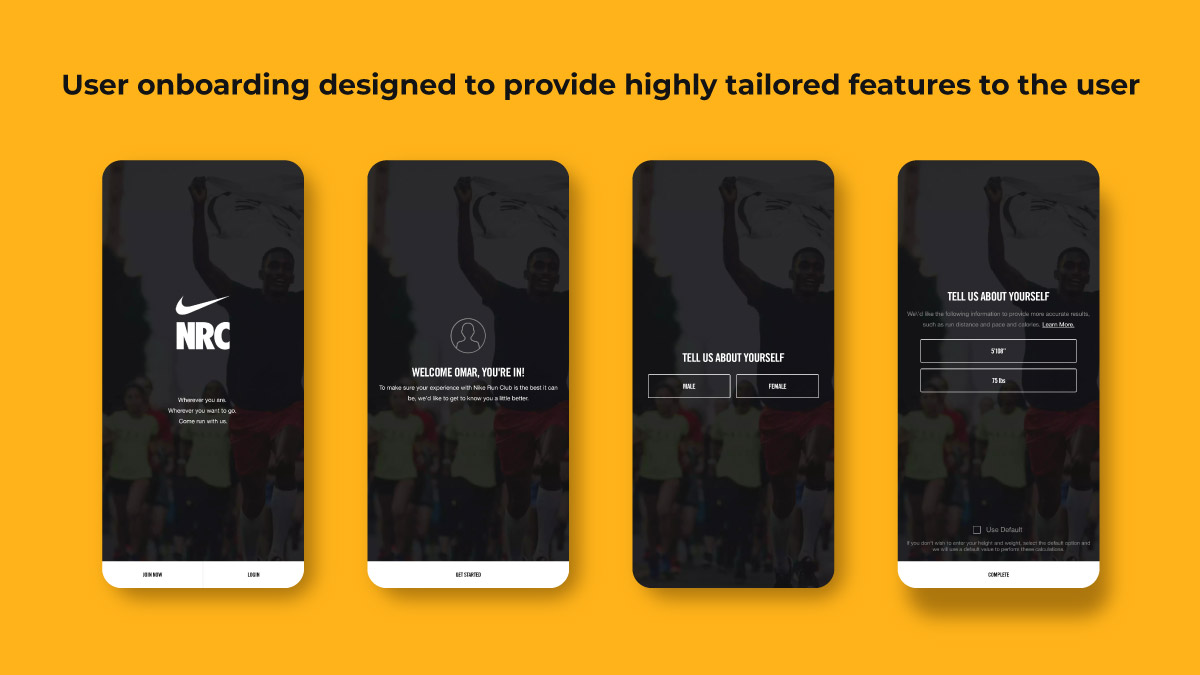
User onboarding flow of Nike Run Club app designed to provide tailored features to the abuse by collecting user data while onboarding them -
When Introducing Important App Features
Important app features or workflows are unique for each app which is why most of them differ from standard UI patterns or are new and unfamiliar. For instance, when we first encountered the feature of mobile cheque deposits as an alternative to in-person ATM deposits, it needed a formal introduction.
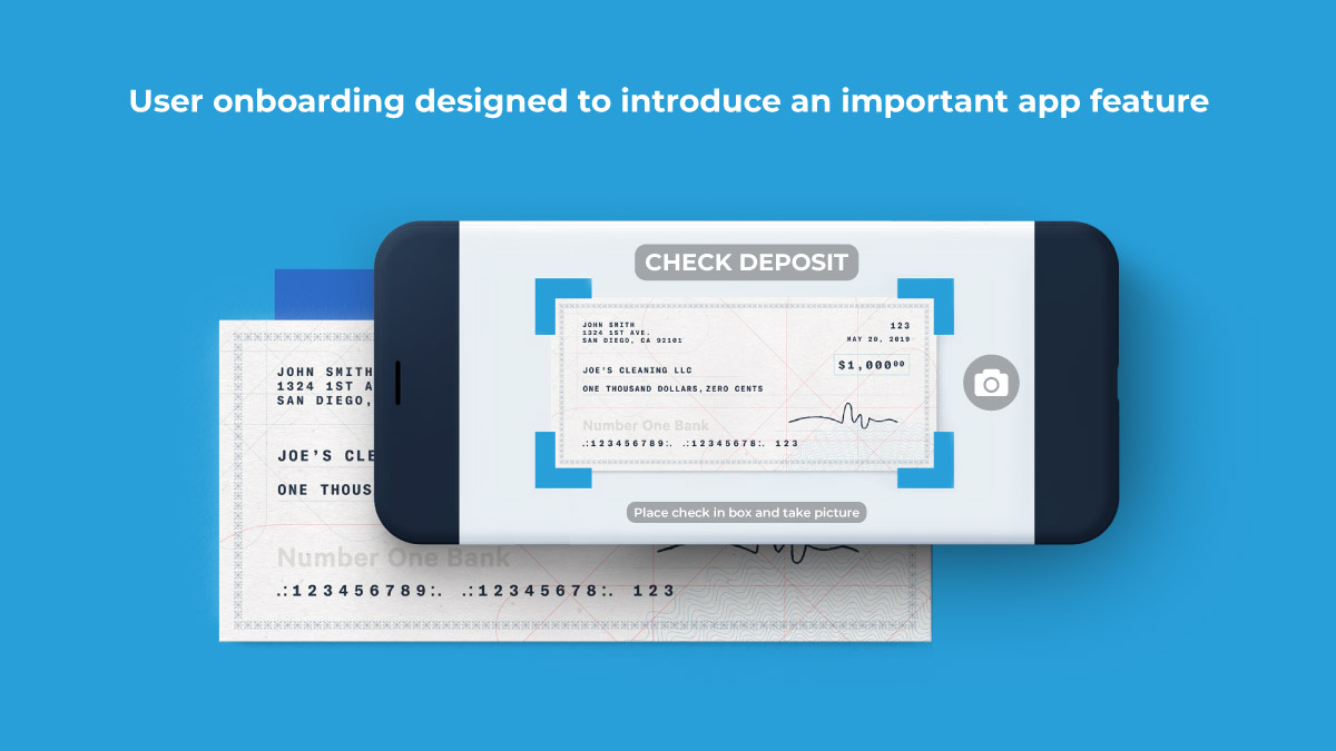
Live cheque submission feature is introduced using a seamless user onboarding
Types of Onboarding
We have three types of mobile app onboarding that can be used to fulfil these distinct objectives.
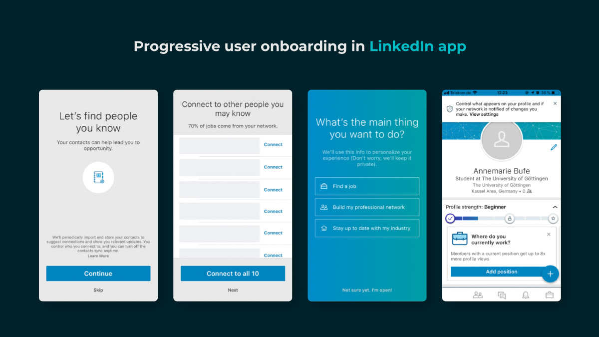
#1 Progressive
It is one of the best app onboarding practices that can be used to display new information on the screen while allowing the users to progressively navigate through the app. This type of product onboarding follows a step-by-step process directing and encouraging the end-users to take action. All the information that is displayed or depicted is relevant to the specific page.Linkedin uses progressive onboarding to create a commitment among the users to continue adding their details and thereby pushing them to use more features of it.
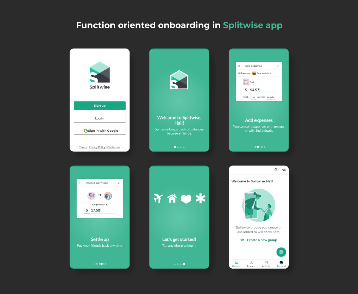
#2 Function-Oriented
Function-oriented is a mobile application onboarding approach that is typically aimed at app functionality and explaining the ways to operate the app to users. By using the function-oriented approach, you can ensure the demonstration of common and rudimentary actions performed in the app to the users.
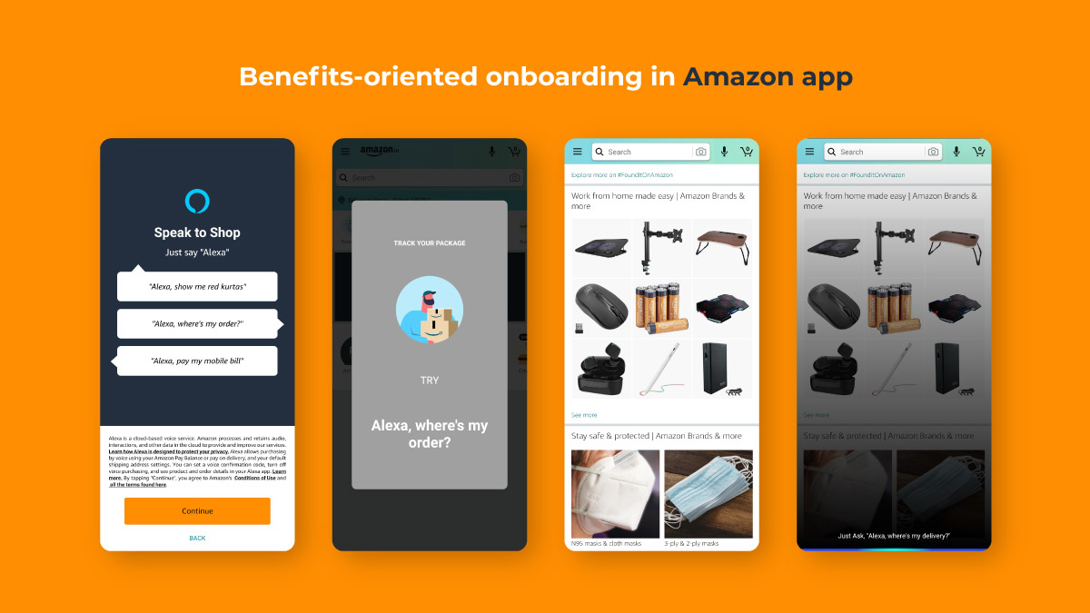
#3 Benefits-Oriented
As the name suggests, this approach for product onboarding is employed to showcase the benefits of the app or the value it offers its users. The ultimate goal of this approach is to increase conversions. Not only this, but it also helps in describing what the app does without elaborating on how to use the app.
Components of Mobile App Onboarding
In mobile onboarding flows, we have three frequently encountered components: feature promotion, customization, and instructions. An onboarding flow can either have one or more of the following components. Let’s discuss them in detail!
- Feature promotion
- Customization
- Instruction
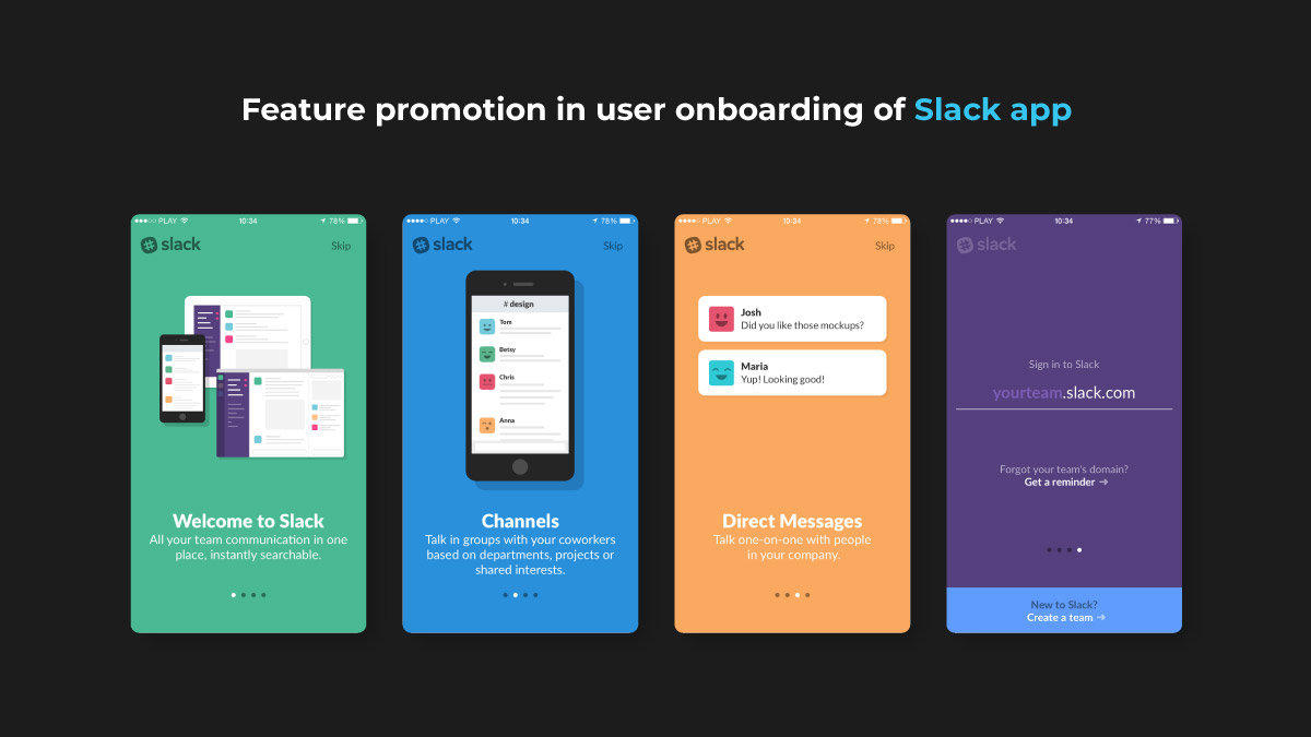
Feature Promotion
Feature-based onboarding is an ideal way to educate users about what the app can do along with what tends to be perceived as marketing. It is suggested that you avoid feature-promotion onboarding at the first launch since users rarely download an app for no reason. Hence, lengthy promotional onboarding will only be a waste of time and must be skipped. But when a feature is truly new or advanced such as the mobile deposit example mentioned earlier, include onboarding.
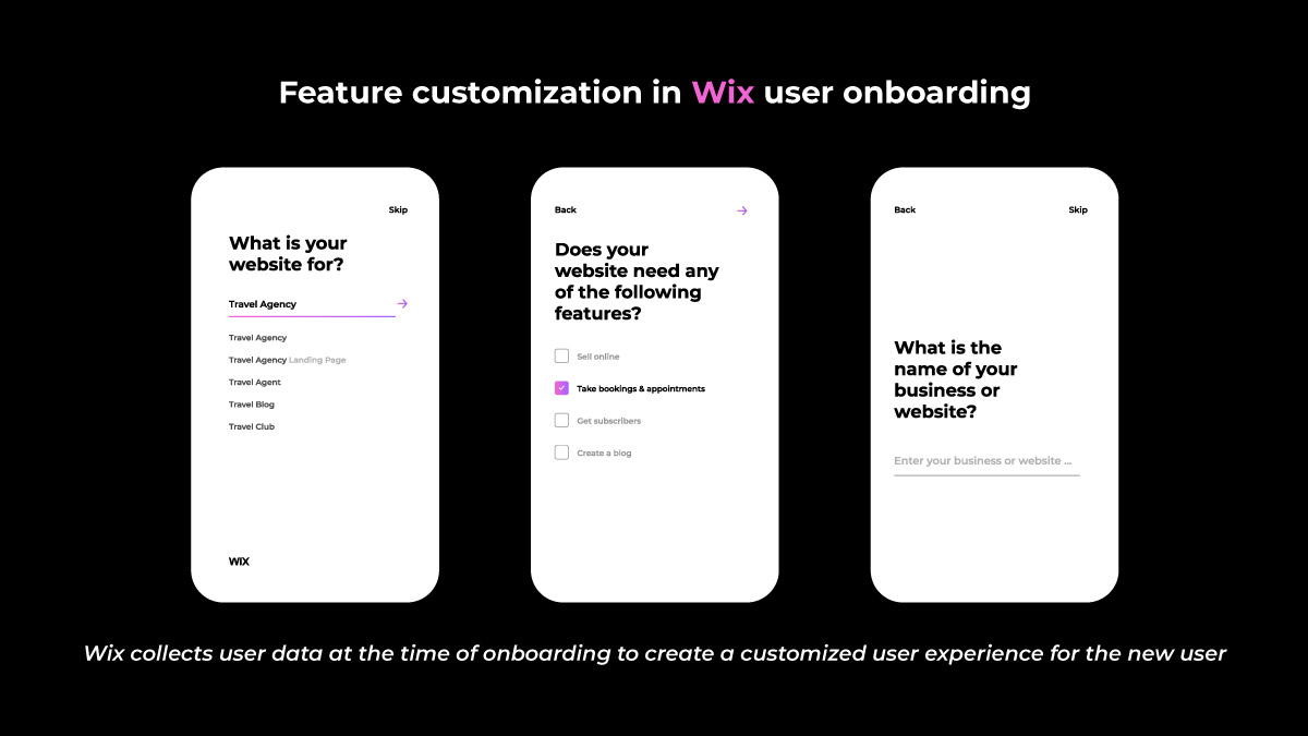
Customization
Many applications need user data to customize the user experience and they request the same from users. For instance, some users might prefer to customize the content or visual design of an app. But it is not necessary that all customization should be done during onboarding.
Talking particularly about visual-design customization such as selecting a color scheme, it is not something you should be covering in onboarding. People can’t decide on how they will prefer the app to look before actually using it or how one visual design is better than another.
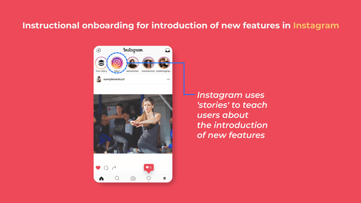
Instructions
Instructional onboarding is meant to teach the users how to use an interface. But remember that instructional onboarding should not be used to supplement poor design. You should invest your resources in making a UI more usable than for creating instructional content. Also, there can be instances where instructions are warranted or expected. For instance, the features or workflows are unique to the app, different from standard UI patterns, or legitimately new and unfamiliar to users. Instructional onboarding can be encountered in multiple forms:
- Deck-of-cards tutorials
- Contextual help,
- Interactive walkthroughs, etc.
Irrespective of the form, you should keep the instructional onboarding brief, optional, and should only highlight the minimum that users need to know to use the app.
10 User Onboarding Best Practices
#1 Prioritize Value Proposition
If you display all the right cards to the users, there is a high probability of them getting converted into active users. It means that showing all the best features of your app is the way to enticing users into using your app. The same can be made more effective if you first highlight the value proposition of your app.
Instead of flaunting your app’s features initially, start with elaborating what the user will gain by using your app i.e., what value does it add to their life. By doing so, you will not only encourage them to use your app in the future but will also provide them with a surety that the app is useful and serves what it claims. Once this is done, you can highlight prominent features and functionalities of your app that will help complete the tasks the users plan to accomplish.
#2 Request Only Mandatory Information
Be as relevant as you can. Would it make any sense that you are asking the users about their favourite books when your app offers fitness guidance? This is why you would need to ask only for what is relevant and most crucial. In case you ask too many questions, users will uninstall your app. So, keep that in mind too. Also, don’t flood the users with excessive questions. Being precise, concise, crisp, and short is one of the most effective onboarding techniques that can boost app user engagement.
#3 Compact Onboarding Screens
Nobody likes a tediously long and extensive user onboarding process as it can easily overwhelm the users to an extent that they will end up finding a substitute for your app, leading them to uninstall it from their device. Not only this, but also don’t use text-heavy explanations or foray of screens.
You need to focus on employing a progressive onboarding approach. Use app screenshots and illustrations to convey the message and to make it realistic. Also, remember to introduce only a single feature on each screen and use coach marks to help users understand how the app works so that it is easier for them to familiarize themselves with it. Tutorials can work as add-ons.
#4 Concise and Simple Sign-Up Process
Users don’t like to spend excess time on the application onboarding process. Help users save their time and be on the top of their list by providing the options of logging in with other accounts, such as Facebook or Google. It will not only save their time but will also decrease a significant amount of friction in the user onboarding process while following all the rules of the sign-up mandate.
#5 Request for Permissions
Asking for permission is one of the most crucial parts of business ethics, especially when it comes to the personal data and information of the users. Let’s say you have an app that requires a camera or microphone facility. Instead of taking things into your hands, ask for user consent. The users will agree if they trust you and your app. The majority of the users respond positively to permission requests given that they understand what they will gain by doing so.
#6 Promote App Content Preview
Promoting app content preview is considered as one of the onboarding app best practices since a sign-up option can act as a barrier between your app and the user. Hence, it is always suggested that you give the users access to the features of your app before you ask them to sign up.
Understand this with an example: You own an eCommerce app that allows the users to go through the products offered on your website. Ask them to log in when they want to make a transaction instead of asking about it when they are surfing.
#7 Make Use of Empty States
Empty states are the screens showing when users have not performed any activity or when no content is added. Empty states can be used as an advantage by making them encouraging. You can educate, guide, and promote users to take action instead of leaving a blank space. Ever noticed how Instagram displays the message saying: No posts yet? Instead of leaving it blank, it offers the users some information. Consider doing the same since it encourages users to initiate any action and use the app further.
#8 Use Visual Hints for Guidance
Don’t hand-hold customers while helping them explore the app. Instead, you can employ progressive visual hints and let them be in charge. All it takes is strategically placing the hints at the places where you predict users may get stuck while using your app. It will not only help you avoid tedious and monotonous instructions but will also help you save the time of users in reading them, which can rather be spent on using the app.
#9 Preach Personalization
Waiting to show your personalization to customers in your app’s features certainly isn’t a good idea when you can provide the users with insight into the same through the onboarding process. Most of the popular apps are popular because they personalize the content of their app based on individual preferences right from the beginning.
Spotify is a leading example for this case that has massive popularity among the users because it provides them with a variety of choices based on language, genre, artists, etc. In short, users have the power to customise their feed from the start.
#10 Take Advantage of Success States
The Success States can be used as a powerful tool for engaging the users on your app. They help you create a positive impression of your app among the users and refer to the screens or popups that appreciate the users as soon as they complete any task. It can be the pop-ups including emoticons or animations congratulating the users when they achieve something in the app or accomplish a task for the first time.
Test Before Final Implementation
Every small bit counts and the output will be a result of the cumulative sum of all these small efforts. You can create a remarkable app only when it is perfect overall i.e., how different elements come together once integrated. This is why it is highly crucial that you test and measure the user onboarding flow for your mobile app on different screens. Not only this, but you also need to monitor the same closely to ensure that the transition to each screen is seamless and smooth.
Last, but not least, don’t forget to include a balanced mix of multiple channels. Using several channels will help you enhance the effectiveness of your onboarding procedure while encouraging the users to come back to your app, especially if you serve the retail sector. You can make use of emails, push notifications, and in-app messages to notify the users of any incomplete action on the app through gentle and friendly reminders.