A brief guide to what to test and how to test in a product onboarding.
A good user onboarding should have short and engaging guidelines which stress the user needs, encourage users to set goals, train users to improve performance and motivate them to keep using the app more frequently.
But how do you decide if the onboarding is good enough for the users?
The only way to know this is to conduct tests on different versions of your onboarding process and analyze the results.
Testing your user Onboarding flow
When tested, a successful onboarding should reveal how often the user receives value from the onboarding process and the elements that trigger user activation.
To understand this, the onboarding process should be subjected to various A/B tests. According to the results, necessary changes should be made in the onboarding flow so that the product value is imparted well to the users. A user should get enough value from the app to stay engaged and loyal.
An onboarding process is a combination of product demos, instructions, live exercises and more. Let us look into the major aspects of onboarding to start testing.
Sign-up flow
A user sign-up is an important milestone in the growth of an app.
This is the user’s first step towards your sales funnel. This sign-up information helps you to connect with the user on a personalized level.
When to sign-up and how to sign up determine conversion. It is important to make the signup flow easy, engaging and beneficial to the user.
What to test in a sign up flow
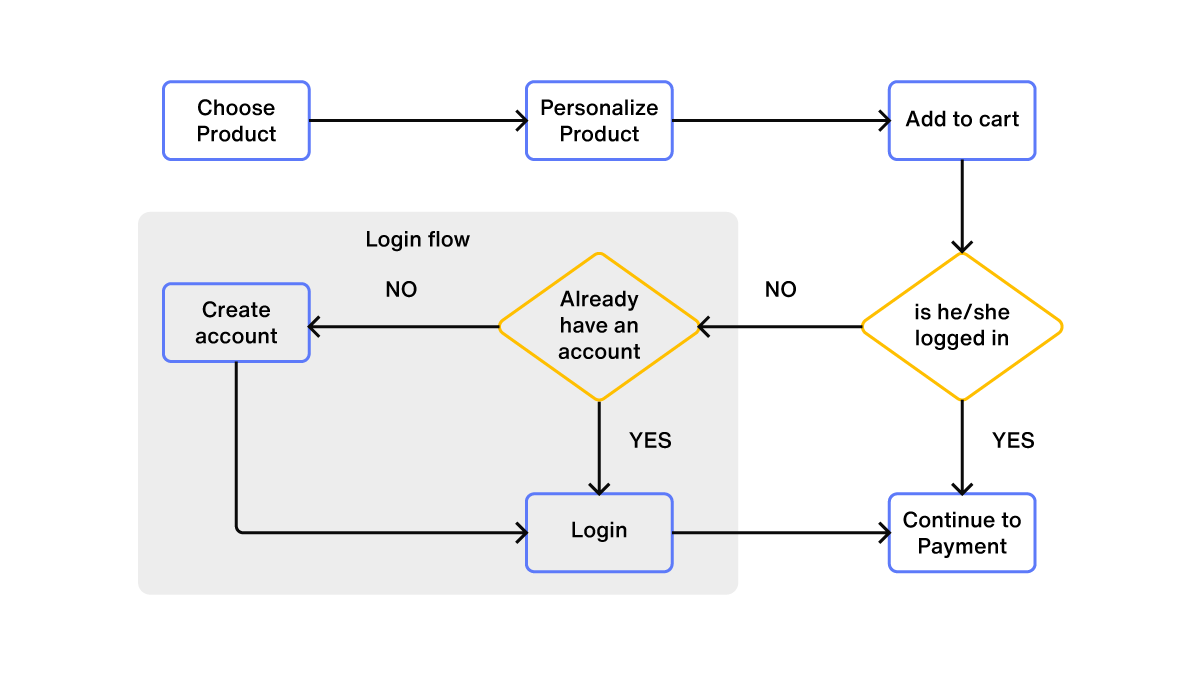
Time of sign-up
The time period by which a user should sign up is another deciding factor for conversion. Most of the time the users prefer to experience the app and realize the value of the app before they sign-up.
But it might not be always possible to delay the sign-up due to the nature of the app. If it is an app that has to provide personalized experience, then delaying sign-up does not help the user. Eg. Pinterest.
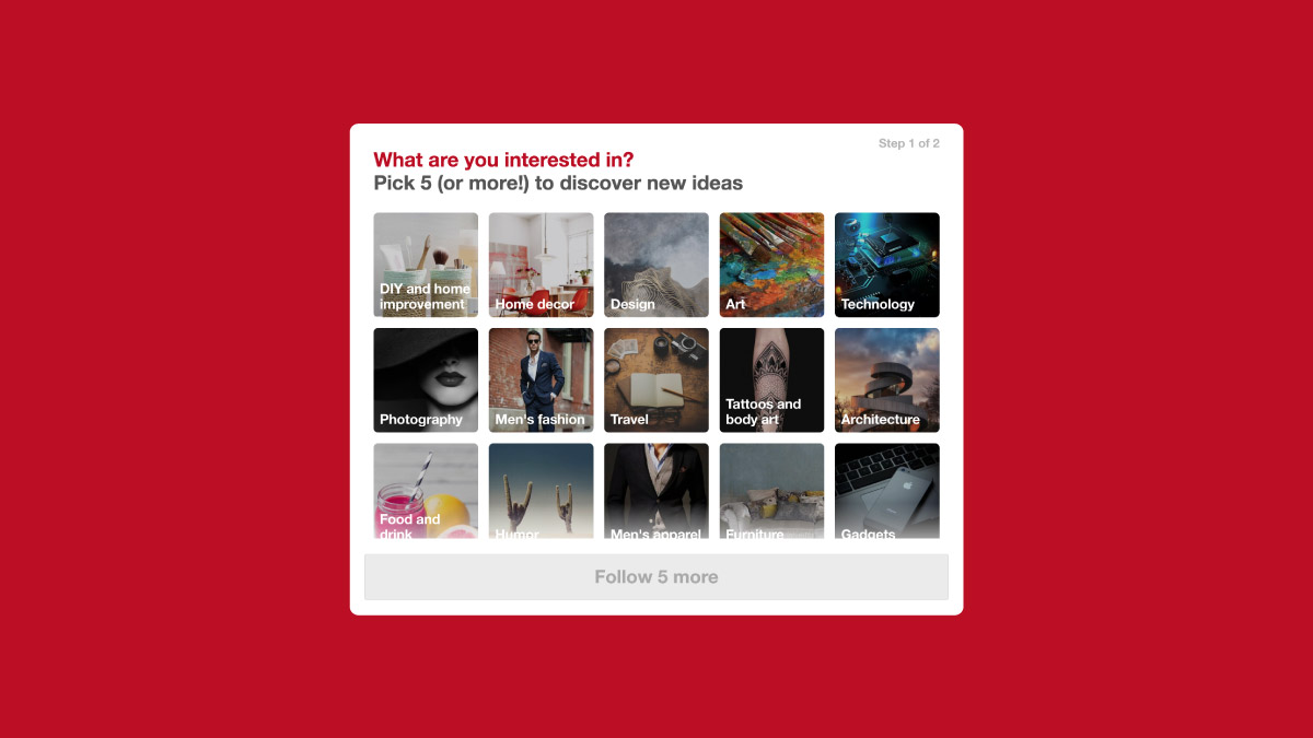
On the other hand, there are apps or businesses that don’t get affected by delaying sign-up as browsing through their products doesn’t require having an account. Eg: e-commerce apps
Sign up options
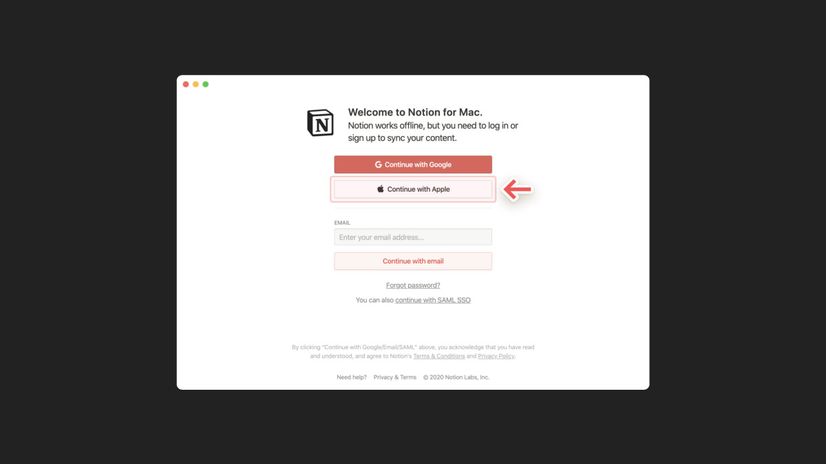
Users tend to stop using an app when they come across a lot of hurdles to simply experience the app.
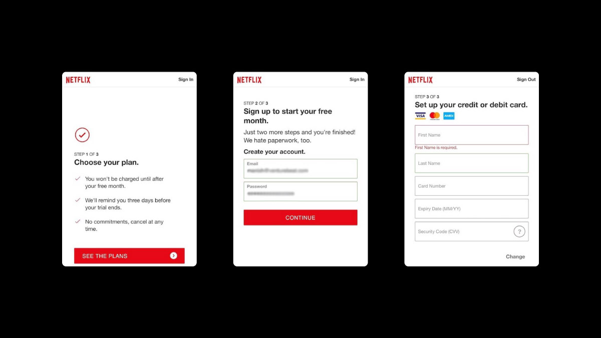
Asking the users to create an account before using the app or requesting credit card information to provide access to the free trial can result in user drop-off. So you should experiment with sign-up options that require minimal user information.
Allowing the users to sign-up with a pre-existing account reduces the trouble of providing data and creating a new account. At the same time giving many options to create an account can overwhelm users and result in reduced sign-ups.
Collecting details
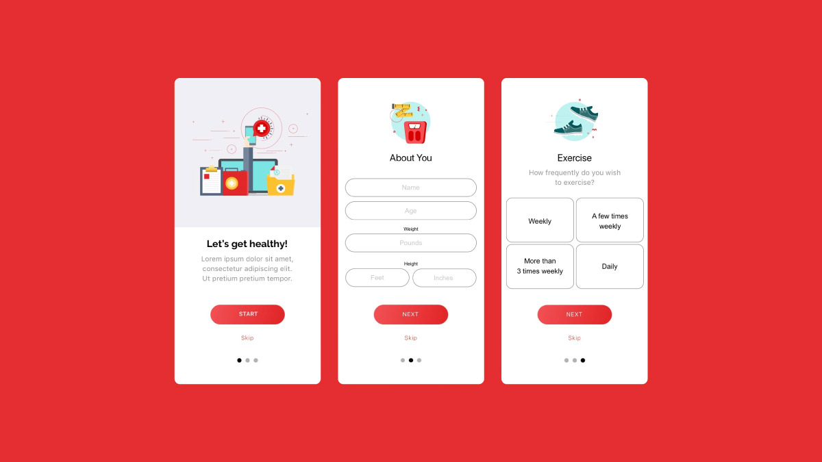
Collecting the user’s data is essential to optimize their app usage and help them become pro users.
Asking for data upfront usually has negative impacts and increases user drop-off rate. It is important that you ask for data that is very essential to provide the user with the best user experience.
Decreasing the number of fields in a data collection form, asking only for essential data at different points during the user’s journey or simply allowing the user to experience the app and then asking for data at a later stage are different ways in which data collection can be designed.
Optimize for conversions
With many aspects combining the product onboarding, there will always be few key aspects that will help the users realize the value of the app and sign-up.
You should first identify what those key features are and work towards getting more people to experience it. Thus you should have encouraging factors or other impetus like a clear copy that will motivate users to continue using the app and sign-up eventually.
A/B Tests to be conducted for sign-up flows
- Highlighting (or hiding) certain features for first-time users
- CTAs
- Animations and other microinteractions that reinforce the desired user action
- Social login options
- Timing and placement of registration request
- Number of fields and screens – what’s the minimum amount of information you need to deliver value?
Product Tutorial
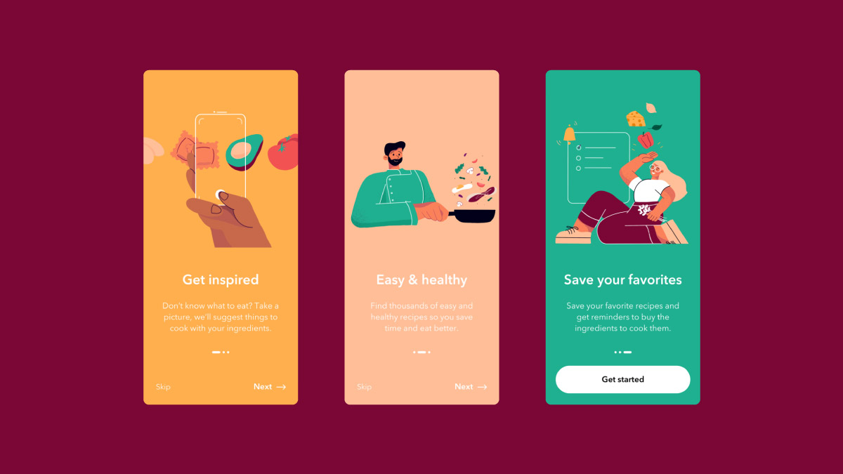
For the user to understand the value of your product they should first understand how the app works. For this, a product tutorial that explains the features and working of the app will be a good option.
In product tutorials, there are a few areas that decide its success. These aspects should be taken care of and tested for best results.
Major aspects to test in a product tutorial
Amount of Information provided
To include the most necessary information in an onboarding tutorial is key to grabbing the full attention of the users.
It is a normal tendency to include everything your app can do in the tutorial. But this overwhelming information will irritate the user rather than educate them. The user will leave your app without a second thought if the onboarding process is stuffed with too many features and content.
Meanwhile, you should also be careful not to provide too little information which might leave the user clueless and confused. They will find it difficult to use the app or understand its value.
Number of pages included
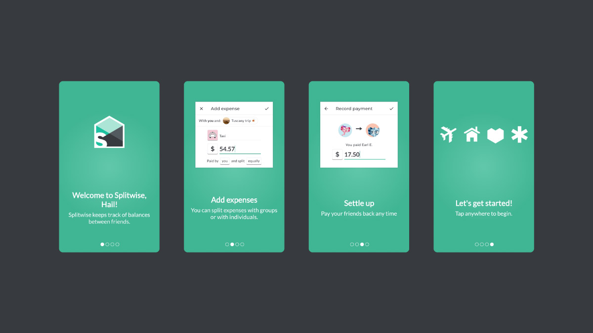
As the number of pages to go through in a tutorial increases, the users might feel it as information overload.
This will become an obstacle for the users to actually start using your app. Lesser the pages, lesser the distance between the user and the app.
In an effort to avoid increasing the number of pages, do not overload tutorial pages with content. Cramming up information on a single page can be as tiring for the users as numerous pages. This can lead to confusion and cause disinterest in users. Your aim is to include only the very necessary information that can be fit into a minimum number of pages.
Personalized tutorials
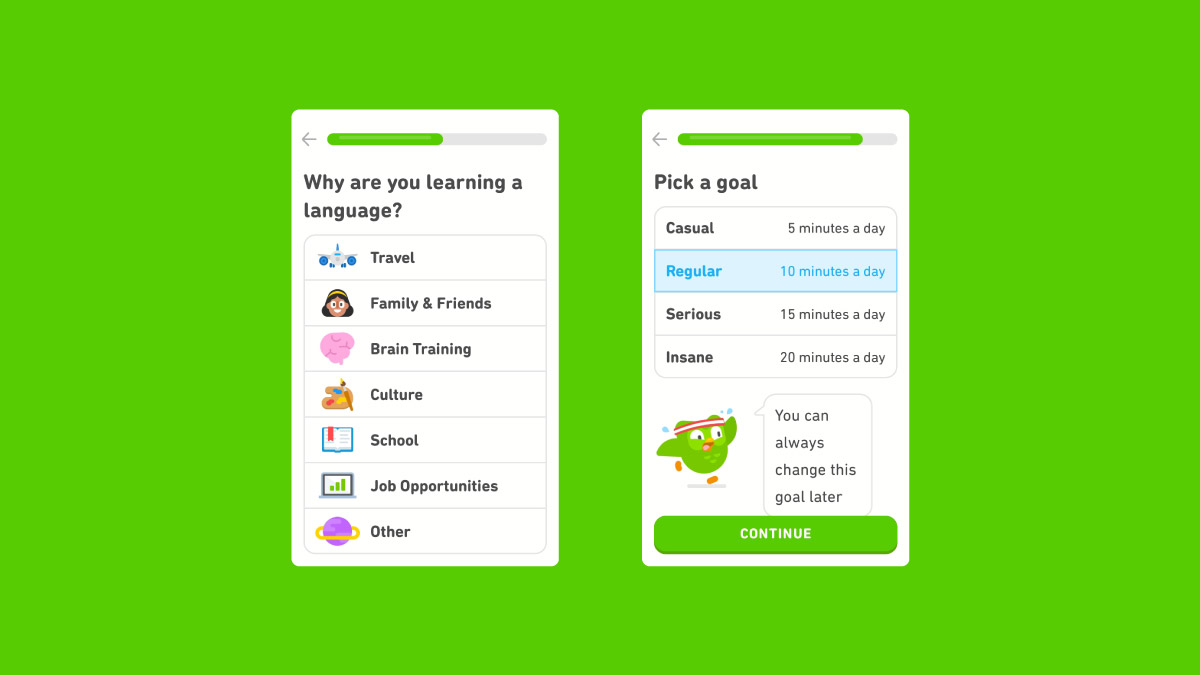
Personalizing onboarding tutorials according to the needs of each user can result in more conversion.
Asking a few questions about the user can help in choosing the right kind of tutorial for them which would help them understand the value of the app better. Questions to be asked should be planned according to the nature of the app. This knowledge helps you in directing the user to the tutorial that will have personalized content that satisfies the user goals.
Users that you gain as the product grows, will have varied personas too. Each user finds their ‘Aha!’ moment at different levels. These user personas and use cases demand for more personalized onboarding flow that prioritizes each user’s moment of delight.
Tutorials or not
You can choose between providing the users with two options.
A short product tutorial or giving them a UI overlay that provides contextual information of the app which helps new users navigate the app and discover key features.
Or you may simply choose to let the users explore the app on their own without interference. Understanding what works best for your app is important.
Copy
Text or copy used in the onboarding process is very critical as these are not just simple directions but props that impact users on emotional, psychological, and action-related levels.
The language used and the ideas conveyed helps in creating a compelling value proposition. You should make sure that a copy that is more straightforward and clear, often drives the users to action than a catchy copy.
A/B Tests for product tutorials
- Tour vs. No tour
- Tour length: number of screens and onboarding steps
- Videos vs. UI overlays
Notification
Timely notifications sent to the users also play a vital role in engaging the users positively and bringing them back to the app on a regular basis.
The notifications should be created according to the concept and nature of the app. The consent of the user is important when it comes to sending notifications.
Major aspects to test in notification
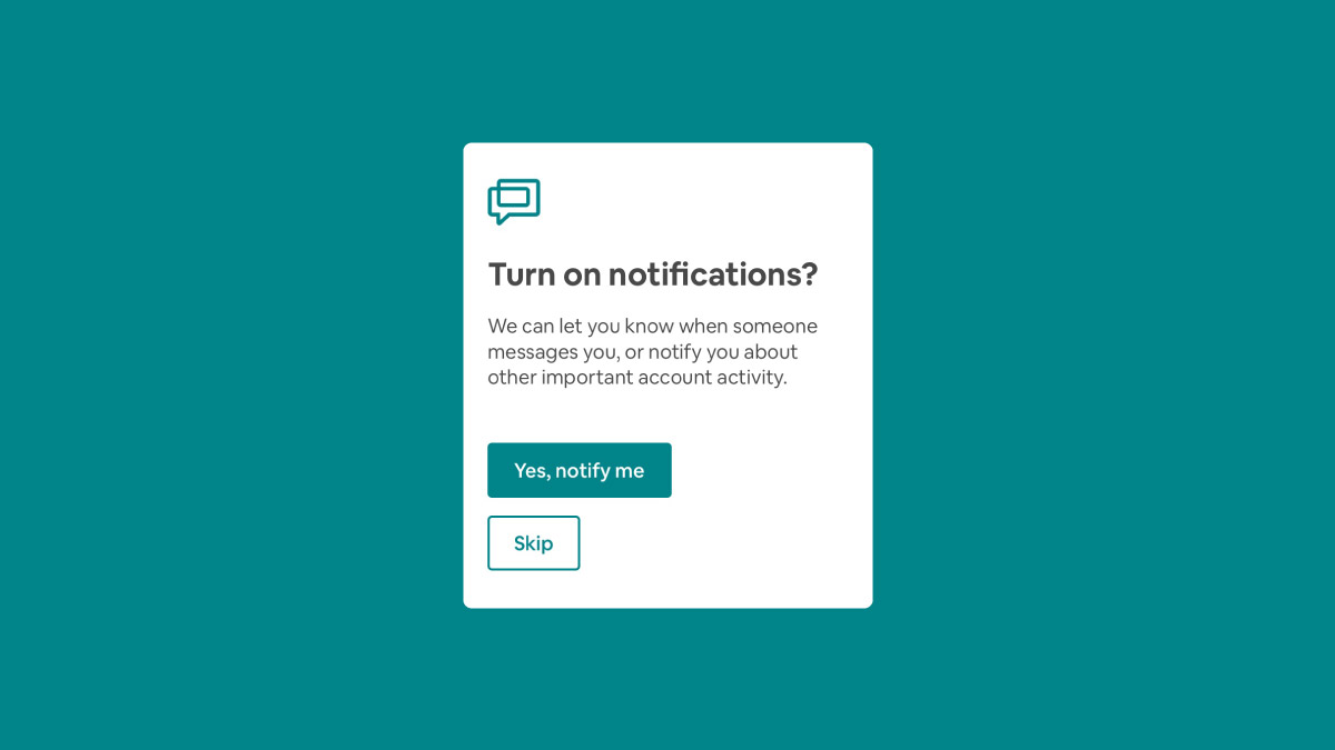
Option to skip notifications
Due to its nature, a few apps can be useless if the user does not give permission to send notifications.
For example, it is critical for the user to allow notifications if they need to benefit from a trading app that should continuously update the user about changes in stock prices, etc. But even if this is the case the user should either be convinced of the need for regular notifications or given an option to skip these notifications and move forward.
Allowing users to explore the app without having to satisfy the actions the notifications call for, can help the user understand the worth of the app and stay for good. Thus a ‘Not Now’ or ‘Skip’ button which helps the users skip the notifications will help in the retention of these users.
Language to request for notifications
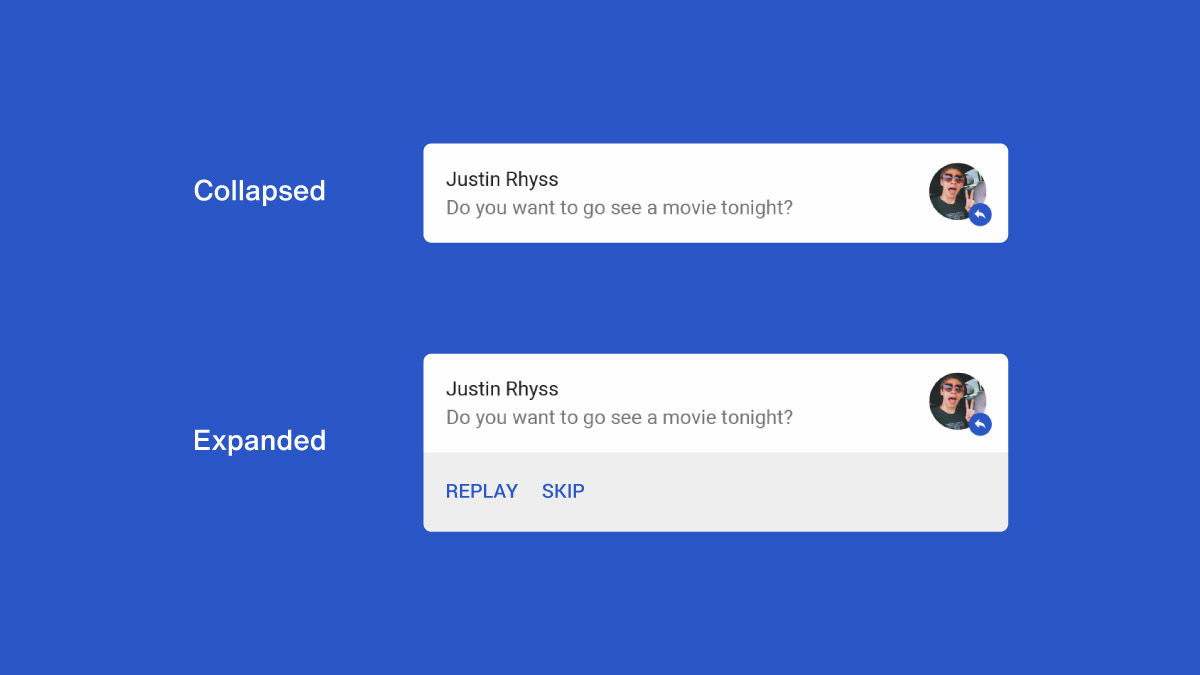
Using direct language to request to allow notifications work very rarely.
A personal, friendly, casual tone used to make the request can work better than plain instructions as these can sound more demanding than a request.
It is better to ask the users to allow notifications using conversational and polite language. This will make the request seem less invasive and more helpful. This warm tone of the request can make your users more willing to allow notifications and continue to use your app instead of leaving it.
Access your welcome email
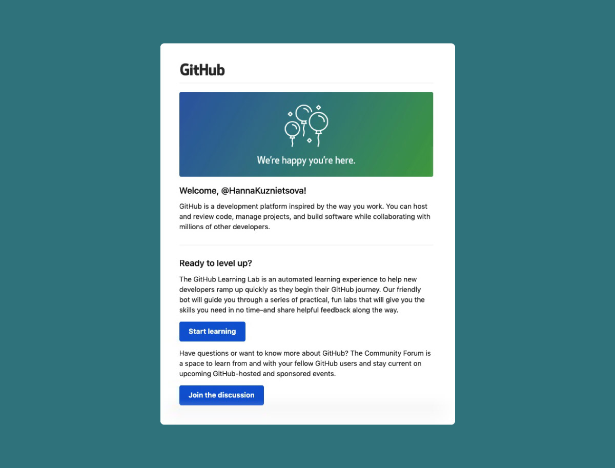
The onboarding process doesn’t happen only within the app. The welcome email sent to the user is also a part of onboarding.
The welcome email helps in giving an introduction to certain features of your app. A welcome email could cover features that are not mentioned in the app but can be accessed and utilized by the user.
For example, the movie app, Bookmyshow, asks only for the user’s location within the app. But in their welcome emails and other notification emails, it highlights features like personalized movie suggestions and programs that match your previous interest.
A/B Tests to be conducted for notifications
- Permissions requests (type and placement)
- Subject lines
- Body copy (focus on benefits rather than features)
- CTA
- Timing
- Different message sequences tailored to specific new user segments(acquisition channel, campaign, user type, etc.)
How to prepare for a product onboarding test
To run an effective user test, a few preparations should precede it. Let us look at the to-do list.
- Set up your test
Your initial requirement would be a design that needn’t be a working model. These requirements should be task-based and these task(s) should be useful and relevant to the tester.
Set a goal and make sure the users complete a task that would lead them to this goal. This will elevate the chances of user sign-ups.
- Recruit the right people
Recruiting the right number of people which should not be less than 5, and the right kind of people who knows what they do is very important in a test’s success.
The email you send as an invite should clearly mention that it is not a sales call so that these people know what they are in for.
- Create your interview script
You should be prepared with a general format for the interviews you conduct. This helps you to compare your findings and land up on relevant conclusions.
The interview should have
- Background questions which help you understand the user, their background, their introduction and experience with your app etc.
- Task oriented approach in which you build a context for the targeted user to act in and get them to complete a task.
- A concluding note that notifies the interviewees that the test is over with an appreciation note for their valuable time.
- Turn your observation into action
Check how many completed the tasks, the questions that arose from them during the tests, study the interviewee’s responses when they got stuck or when they reached their aha moments.
Changes should be made according to these findings to make the user onboarding experience flawless.
Conclusion
Testing the worth of the user onboarding process is as important as developing it.
Understand what to test and utilize the different testing methods to make sure the onboarding process imparts the value of the product to the users to decrease the user drop-off rate and ensure the success of your app.
