Designing with people in mind—that’s what human-centered design is all about. It takes more than a creative concept, impressive visuals, and clever marketing to make a product truly successful.
For something to be beloved, it needs to consider the user’s wants, needs, desires, and even dreams—and that’s precisely what human-centered design does!
At its core, this approach advocates for designing with empathy before any other considerations. This means involving the user throughout the process, from prototyping through testing, to ensure the result is precisely the solution they seek.
So what does that mean for the modern-day product designer or entrepreneur? It means transcending current trends, standing out from the competition, and creating a unique solution to the user’s problems.
By understanding the user’s story, we can develop an experience that succeeds in the market.
Human-centered Design Explained with Everyday Products From WowMakers Digital Media Studio
What is the Importance of Human-centered Design?
Human-centered design revolves around the approach to UI/UX designing that enhances the website or app’s usability and user experience. A website can only be helpful to users if they do not find any hurdles in accessing each feature, content, and link. Then, it conveys the sign of a stable and valuable user interface.
Supposedly, a writer would look for affordable child illustration solutions for his picture book as children tend to prefer visuals over books that are bloated with content. Why is that so? That is so because it enhances a book’s readability levels and intrigues young readers.
It is the case with an exceptionally designed user interface, as, without one, the user experience, user interaction, and accessibility of a web platform or app are significantly compromised. Without following a human-centered design approach, you end up jeopardizing your credibility.

Let us help you transform/design a product for humans
Talk to Us
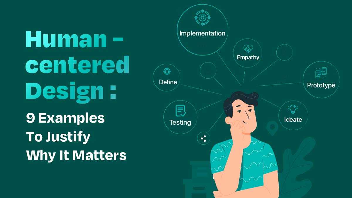
The Six Phases of HCD Human-centered Design
The Human-Centered Design (HCD) Six Phases offer a framework for identifying and resolving issues via an iterative design approach that stresses empathy and user-centered solutions.
The six stages are empathy, Defining, ideating, Prototype, Test, and Implementation.
Empathy
The Empathy phase entails performing research such as interviews and observations to understand customers’ requirements better. This aids in developing empathy for the individuals who will utilize the product or service under consideration.
Define
Designers uncover possibilities in the Define phase by examining insights from earlier research and building a shared vision with stakeholders. This enables them to understand better the context in which their solution will be implemented.
Ideate
Designers enter the Ideate phase after defining their issue and generating ideas to meet user demand. They may employ brainstorming techniques like rapid prototyping to investigate numerous solutions to a problem.
Prototype
Designers build mockups of ideas at the Prototype phase to test them with users before committing too much time or money in development. This helps to prevent expensive errors later in the design process.
Testing
Before implementing, designers assess their prototypes with actual users to establish what works well and needs improvement. This enables them to develop their original design idea to fit the user’s demands more successfully.
Implementation
Eventually, in the Implementation phase, designers transform their tested prototypes into practical goods or services that real people can utilize in their daily lives. This guarantees that consumers can access efficient and effective solutions in meeting their demands.
If you have decided to focus on human-centered design, here are some examples that explain why a good UI/UX design matters.
Principles of Human-centered Design
Human-centered design is a creative approach to problem-solving that puts people first by focusing on the needs of individuals and communities.
It begins with understanding the people affected by a particular design challenge, and then it involves creating solutions tailored to those needs. To achieve this, there are several core principles that designers should follow:
#1) Understand Empirical Realities
Before designing a solution, take time to understand the context in which it is being used. By doing research and having conversations with people who will potentially use it, you can gain insight into their lives, habits, desires, and concerns. This can help inform your design decisions and ensure they stay true to the mission.
#2) Embrace Creativity
Creative confidence allows designers to develop innovative ideas without fear of failure or judgment. Spend time exploring different perspectives and possibilities before jumping into the development process—this will help ensure that the final product meets user needs in meaningful ways.
#3) Seek out Diverse Perspectives
Designers need to engage with users from different backgrounds and experiences to create inclusive designs that meet everyone’s needs. This means actively seeking out individuals from various demographics, cultures, and lifestyles when conducting research interviews or focus groups.
#4) Empathize Deeply
When creating a human-centered design solution, consider all angles of how people interact with technology—from physical interaction to emotional connection—to create something beneficial and meaningful for people’s lives.
#5) Validate Your Assumptions
Once you have a proposed solution, test it out on at least five potential users before moving ahead with implementation or production—this will give you accurate data points about how well (or not) your idea works so you can make necessary improvements before launch day arrives.
#6) Think of Everything as a System
All elements within a design should be considered part of an interconnected whole where each part affects each other piece and overall performance. Pay attention to how micro-interactions influence larger behaviors or patterns to create more cohesive experiences across platforms or mediums over time.
#7) Embrace Ambiguity
No matter how much research you do, there will always be unknowns during any project development process—realities that you may not have anticipated beforehand but could still affect outcomes if ignored or mishandled during later stages of development or testing/evaluation processes afterward. The key is to remain flexible enough so that when these surprises arise, your team can adjust quickly without compromising quality in any way!
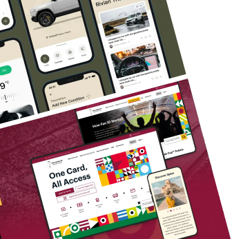
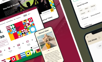
Check out our portfolio and see how we can elevate your user experience.
Know More!
1. Create Design Solutions to Solve an Uninteresting Issue
To devise a process for user-centric design creation, you sometimes have to divide it into multiple stages. Forming a rough draft of the concept is always better than transforming it into a complete design.
Creating design solutions in stages allows you to develop new ideas frequently and test out possible design solutions to improve your design gradually.

A potential example could be the website of Turbo Tax which focuses on the notion of intuitive design and for more personalized user experience. This addition of personalization allows the viewer to interact with a tedious issue but in an engaging manner.
2. Bringing Simplicity into the Design
While Duolingo is one of the most widely used language-learning apps with millions of downloads on both the Apple and Android app stores, the people who have used it must have noticed its simplistic-looking design.
If you analyze it more profoundly, you will notice that the app follows the rules of gamification, and you can only proceed further once you have finished a specific task or game.

It contains CTAs on the right page and allows you to advance to new learning categories after completing your learning goals. It works thoroughly and systematically and has been gamified to keep the users engaged and revitalize the notion of learning a new language.
3. Keeping it Minimal with Relevant Features
A good UX design does not have unnecessary design elements and features. A befitting example would be of Trello, an online collaboration tool that allows you to keep your projects and discussion boards organized in one place.

As for its UX design, Trello has a compact interface and does not contain additional features. Adding features that serve no purpose only complicates the user experience and interaction with the tool.
Users can easily navigate through the boards as Trello focuses more on an intuitive design that simplifies website navigation for the user.
4. Uncomplicated Usability
To understand human-centered design better, Airbnb, an accommodation-sharing platform, can be a prime example. The platform has worked to improve its booking functionality by revamping it with a sleeker and smoother user interface. Airbnb would not have over 150 million users to date if it were not for a user-friendly interface.

The Airbnb app follows the same human-centered approach for its UI/UX and serves uncomplicated app usability to its users. Users can easily make new bookings, host a home, and enter the relevant date, time, and number of people they intend to book a home for.
5. Easier Navigational Options
The core foundation of Yelp is to serve as a social networking platform where users can post reviews for numerous businesses and make reservations. Still, if you carefully look into its design, you will notice that the platform has enhanced its usability with convenient navigation features.

Users can quickly discover and navigate the list of available restaurants with its map feature. You can find the exact location of a specific restaurant before making a reservation. Once you have decided, you can schedule your order and deliver it at your chosen time.
6. An Adaptive Interface for the Visually Impaired
If you look at the interface of Instacart, an online grocery delivery platform, you will notice that when you navigate to browse different departments, the product showcase is well-defined for those who are visually impaired.

The selection of color and contrast befits the visual preferences of people of every sort. Designers have meticulously taken care of intricate details. When you add an item to the cart, the option to increase the number of products is present in the main interface, without you having to go to the Cart option to increase the product quality.
7. Add Instant Feedback Options
Users tend to look for instant feedback options mainly on websites, and something as simple as that should be prioritized by UI/UX designers. Enhancing a website’s usability is based on making the website more human-centered. A great example of instant feedback can be Microsoft’s website.

Microsoft has added all of its products on the main page; therefore, users can easily select the available products without having to go to multiple pages to view the products. In case someone wants to view and purchase the Xbox One, they can click on it from the main page.
8. Always Prioritize Accessibility
The interface design of both websites and mobile apps should be designed so that users can quickly acquire the information they need. This notion is known as accessibility, and it matters a lot for the UX design of a website or app.

Whether it is a website’s sitemap or the options in a search bar, every feature needs to be visible and accessible to the user. The Mac page on Apple’s website can be treated as an accessibility epitome. The web page has every such detail that a user would need to understand the product types, speculations, and features better.
9. Precise Use of a Sitemap
The concept of site orientation is based on how its navigational features are designed and the navigation options can be designed in several ways. The most basic and widely used design approach includes a website’s sitemap.
The sitemap has every link and page clearly defined from the Home page to the website’s internal pages. However, these links and elements need to be visible. A sitemap is needed for stress-free navigation.

The design of PayPal’s sitemap has numerous links, which might sound a bit complex, but it is not. It provides ease of navigation as everything a user would need is present in the sitemap’s links.
Final Note – Why Human-centered Design Should Never be Overlooked?
Any online platform or mobile app is solely designed for its users; for that reason, it should be made to provide the user with the ease they are looking for. When user needs are overlooked, the website tends to lose its value, as nobody would prefer accessing it.
Designers should not neglect this fact, as it would affect the credibility of a designer’s career and create barriers in differentiating an exemplary user interface from a bad one.
Designing user interfaces is thorough and requires a designer’s utmost dedication and effort to develop something that is simply impeccable. While the aspects to consider for a quality human-centered design interface are countless, if you put great thought into it, you will surely be able to create user experiences that provide users with the ease they ask for.
FAQs
#1) How does human-centered design differ from design thinking? / Human-centered design vs design thinking
Design thinking and human-centered design are both processes used to solve problems. Both approaches have the same goal – providing a solution that improves the customer experience while solving the problem at hand.
Design thinking
- Design thinking is an iterative process designed to identify user needs, brainstorm solutions, and incorporate user feedback at each stage of development.
- It starts with researching the existing context of a situation to understand the bigger picture, followed by ideation and prototyping phases before finally settling on a final product or service.
- It heavily emphasizes innovation, emphasizing generating ideas outside of what already exists to discover novel solutions.
Human-Centered Design
- Human-Centered design is focused on improving the customer experience by solving problems from a user’s perspective.
- It takes an empathy-driven approach instead of focusing exclusively on innovation like design thinking does.
- HCD prioritizes creating solutions tailored specifically for users that are easy to use and understand.
#2) What are some common misconceptions about human-centered design?
Some common misconceptions about the human-centered approach are:
- Human-Centered design is all about aesthetics. Human-centered design is not just about making things look great. It is a process of understanding people’s needs, developing ideas and solutions to meet them, and testing those solutions with users.
- You need a designer to practice HCD. An effective HCD practice requires a variety of disciplines and cross-functional teams that collaborate and learn together.
- Learning only happens at the start or end of a project. User feedback should be incorporated throughout product development for continuous discovery.
- HCD is costly and time-consuming. Some may think that human-centered design is too costly and time-consuming, but investing in user research and testing can save time and money in the long run by creating better solutions.
#3) How can organizations integrate human-centered design into their culture and operations?
- Encourage collaboration
- Integrate customer feedback into operational processes and daily decision-making.
- Make it part of the design process.
- Promote an environment of empathy.
#4) What challenges and limitations do designers face when using a human-centered design approach face?
Some of the challenges of using a human-centered design approach are:
- The human-centered design relies on user input, which can be limited by users’ inability to articulate their needs or by biases affecting their feedback.
- Balancing the needs of multiple stakeholders, such as users, the business, and other stakeholders, can be challenging, and solutions must satisfy all stakeholders.
- Translating the design into development can be difficult and lead to discrepancies between the design and the final product.
